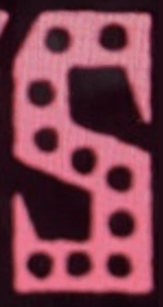
Sorry, this is custom drawn lettering, not a font. Take a close look at the repeating letters and you’ll notice that they aren’t identical (dots aside): in the second P, the counter is narrower and the top left serif more pronounced. The two S’s exhibit differences as well: